Showing posts with label Illustration. Show all posts

Thursday, 18 October 2018

Super Funky Tote Bag


Hello, housemates! I see it's over 7 months since I last did the blog thing. Tut. All I can say is, when your daughter asks you to help out with her wedding invites and all the other crafty stuff, well, you just can't say "No," can you? More of that in a future post...

Anyway, yesterday, I received my much anticipated haul from Carabelle Studios. Some of you may know that Yorkshire's own Kate Crane is now designing for them and her first 'batch' is now available. Did I buy the whole lot direct from Carabelle in France because I was too impatient to wait for UK stockists? Yes. Yes I did. It was rude not to, quite frankly.

 Stencils (including a nice little freebie mask)
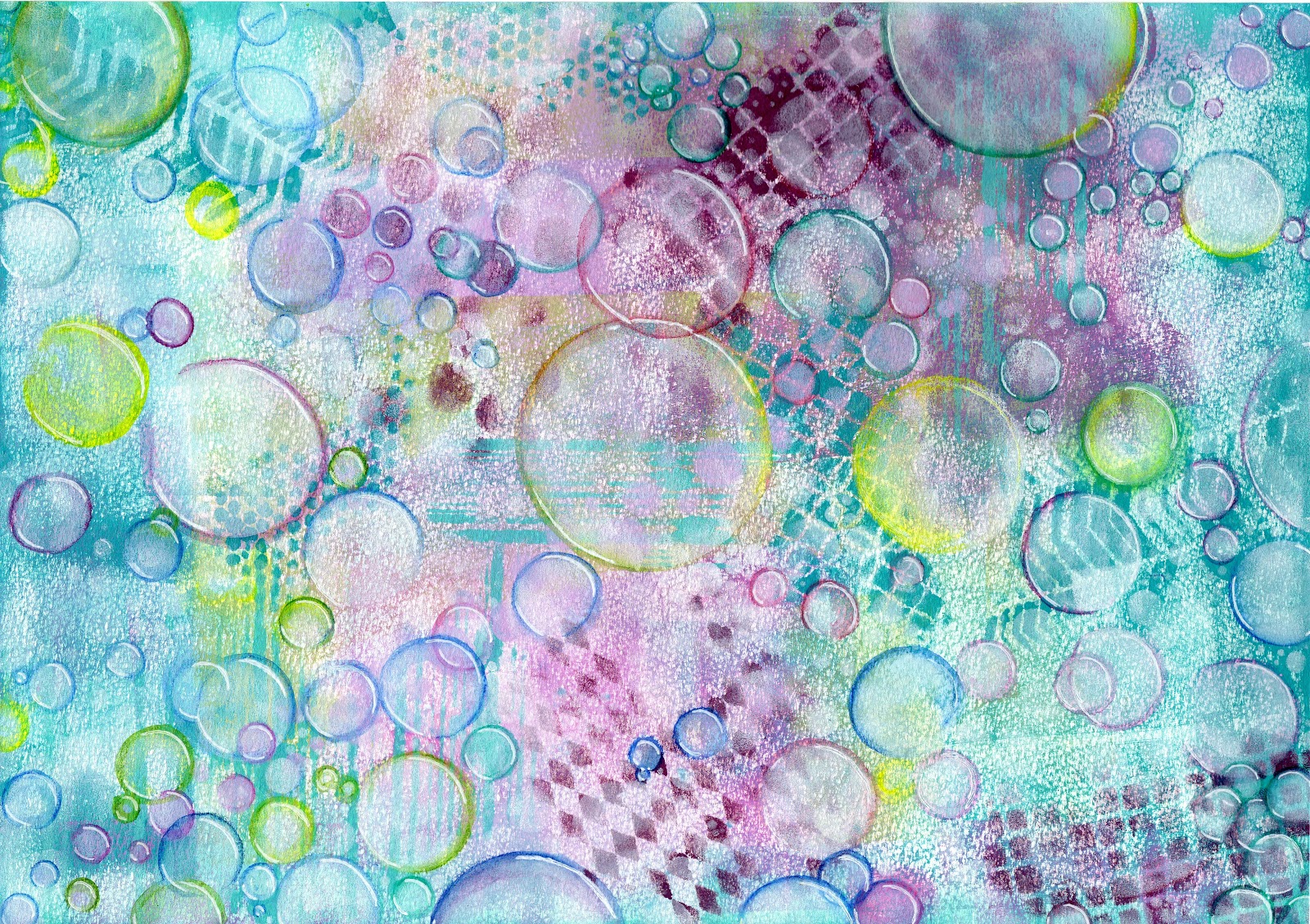

 Stamps


Art Printing Plates

So much lovely but where to start? I had to have a place to pin all of my button badges (Kate Crane's) and a tote bag was the perfect place. I was so desperate to monoprint onto the canvas bag using the Art Printing Plates. I thought I had a 6" round gel plate but I only have 4" and 8". 


I never need an excuse to use stencils. This Noughts and Crosses stencil is also available in a smaller size, but using the large one allowed me to do it in one go.


Magenta added when the Fuschia had been lifted.


Finger Painting in the centre. Lemon, Lime and Sky...


Squidge the Art Printing Plate on top...


And yum! A snazzy, bright mix of doodley patterns. I want to call it 'Crane Chaos' but only in a good way, you understand. It's for a tote bag and I'm going to keep it for myself so I can call it what I like. 


Oh, it's looking hopeful!  I should've wiped a bigger circle to allow more of the centre colours to show through...


But it just wasn't liking the canvas of the tote bag. 


I finally managed to get some marks down onto the bag, but it was just a complete mess.


Taking the advice of Mick Jagger and painting it black...


So anyway, the edge is neater. I know I should probably have prepared it somehow; washed it, at least. Pff. I don't have time for things like that when I'm possessed by the muse. So, stencils, it is.


I managed to line up the Noughts and Crosses again...


Then I just had to jump in with the Fiesta round stencil and kill the gorgeous Polka Dots from the Art Printing Plate (there's no time to get precious about these things - I'm nearly finished!)


Perfectly bright and totally fab and groovy.


After I've carefully placed the button badges (available on Kate's Etsy store) my bag is ready to go. I already have black and white pens inside it ready for the final doodle thing.
I LOVE IT!

The moral of the story is, if you get that flat feeling when your project just doesn't look anything like you thought it would, just keep going. Try a different technique or different materials and media. Go right in over the top of the mess you created. Don't get frustrated. And, whatever you do, don't give up.

Love and peace,

Wendy x

PS Art From the Heart in Harrogate is one of the UK stockists, but I think a lot of the items sold out pretty quickly. They will restock, so submit an email request on the items you want.

My Social Media:


Monday, 29 August 2016

'Fauxdori' With Dangly Bits


This blogpost is one of 'firsts'. I'm not a stranger to making handmade books and journals but there are many different techniques and types of journal. When my friend, Karen, asked some advice on making a cover in the style of a Midori (an Italian, leather-bound travelers note book, not the melon flavoured liqueur), I decided it was time that I gave that style a go. I must add that she wasn't hinting and didn't expect me to make one. She just wanted some advice.   

Because this type of journal is in the style of a Midori, it is commonly called a 'Fauxdori'. I asked Karen lots of questions about what she uses her individual, stitched notebooks for and she told me that she draws out weekly diaries, finances, birthdays and events etc. She has a lovely style of creativity herself and I'm sure she is perfectly capable of doing this herself, which was her intention. She doodles toadstools and circles and was prompted to ask me about a Fauxdori after seeing my Bubbles notebooks.

Obviously Paperartsy sprang immediately to mind, and JoFY stamps in particular. I brayered Fresco Finish Chalk Acrylics in all of the blue and turquoise shades over an A3 sheet of Strathmore mixed media paper. I darkened it when it was too pale and lightened it when it was too dark. I carried on brayering in this way until I was happy with the look. Then, because Karen had liked the bubbles, I used my favourite Donna Downey stencil, called 'Bubbles', funnily enough. I lightly stenciled Antarctic through the bubbles using a makeup sponge, then Snowflake through JoFY's Bloom and Grow flower stencil (PS008) and finally, Guacamole through the lettering. I stamped a selection of JoFY stamps strategically all over. I left it to dry and turned my hand to making some things to dangle from the journal.


The current Paperartsy challenge on their blog is Beads, Charms and Dangles. (That's handy, isn't it?) There are some YouTube videos on the blog to inspire you amongst all the other inspiration there. One is the Leandra Bead and another is European Paper Beads. I had a strip of paper trimmed from the Fauxdori masterboard which meant that I could make dangly bits that perfectly matched the cover in colour. I really enjoyed making these beads (except for the time when I dropped a molten bead on my hand... Oh and also the time when I dropped another on the carpet!) 


 The Leandra Bead 


        European Paper Beads

I couldn't guess the measurements for the cover so I stitched 5 single signatures, each with 6 sheets of A4 160gsm paper. Then I marked on the inside of the journal where the scorelines should go for the spine. I added 5 eyelets on each end of the spine. This is when I realised that I had measured from the wrong end and had to trim some of the stenciled lettering away just to make it look even. 


I threaded some elastic that complemented the turquoise shades through the eyelets on the spine. This forms a secure attachment for the signatures. I chose a larger eyelet and some more elastic in the same colour for the closure. I attached the beads so that they dangle from the top of the spine. A large knot wasn't adequate to keep the beads attached and it disappeared up the central core. A small jump ring threaded over the elastic fixed this issue and actually looked much neater than a big, scruffy knot.

Then it was just a matter of finishing touches. 


I used a combination of Sakura Gelly Roll pens (Glaze, Moonlight, Stardust Galaxy and Metallic), Dylusions paint pens in black and white, Fresco Snowflake and Sherbet, and even a thin swipe of Diamond Ice Stickles over the dragonfly. Basically, anything that I could put my hands on.

And ta-daaa!


Love and peace x


I'm linking this up to Paperartsy's 2016  Topic 16: Beads, Charms and Dangles challenge


Wednesday, 17 August 2016

Go Away I'm Marking


This one is a bit different. Working on wood is a first for me, but I wanted to make something for my daughter, Danielle, that was a bit different from the last sign I bought her! That one read "Piss Off I'm Busy". Not really appropriate for a music teacher, but I thought it was funny at the time. You had to be there...

Anyway, out came my Paperartsy Fresco Chalk Acrylics. Obvs. I covered the sign with Little Black Dress and then ran some alpha dies through my Big Shot machine. I used Bigz Extra Large Die Word Play by Tim Holtz for 'Go Away', Just A Note Thinlits Alphabet by Jen Long for 'I'm Marking!' and then added the ink splat from Scribbles and Splat Thinlits die set by Tim Holtz for good measure. I tore some manuscript bits from some Tim Holtz tissue because Danielle teaches music.   

After all of those fiddly bits were stuck into place, I covered the whole lot with some Crackle Glaze, waited for it to dry, then I painted over with Purple Rain (*nods to Prince*). There was some amazing texture happening, just like magic...


I had to make it all pop a bit more, so I played with Chalk paint, pens, rubbing the paint back again, but it still looked all wishy washy and not at all me.


I squidged a warm grey Faber-Castell Big Brush marker around everything. Then sponged Little Black Dress and Chalk over the splat and 'I'm Marking!' I loosely scratched around the lettering with a black pen, trying to grunge it up. It did help to lift it from the background, but I asked my lovely PATwits family on Facebook if there was any advice to be had from here...


... and the wonderful Siobhan Brignull encouragingly said that it was fab, then constructively suggested I add some Treasure Gold. Now, I haven't got around to the Treasure Gold yet, but I do have a selection of Creative Expressions gilding wax in several colours. I rubbed some Pewter around the edge and highlighted the sticky up bits (technical term) with it. It was much better, but I still wanted more oomf (another technical term) so I highlighted everything with a white Posca pen. 
Finally!...

The good news is that Danni loves it. But then, would she dare say that she didn't? She seemed pleased that she had a sign that was suitable for children to see, anyway. 


Love and peace x


Tuesday, 16 August 2016

Painted Fragile Paper


I have another pattern for you. This time I painted layers onto fragile paper, in this case tissue. I used the brayer technique with Paperartsy Fresco Chalk Acrylics, as is my wont.


I started with 4 layers of paint (Haystack, Pumpkin Soup, Tango and London Bus), Haystack being the only opaque colour. In the beginning, the tissue felt very fragile indeed, but by the end of this stage it already felt tougher.

I decided to use the stamps that I handmade several months ago. Incidentally, to make my stamps, I drew an image of my own design onto some Speedball Speedy Carve, carved it carefully with lino cutters and mounted each one onto EZ Mount. Mmmm... circles...


I stamped onto the tissue using the fours colours in the background. I felt it needed a bit of a punch so I brought in some Claret. Here is a selection of photos taken through different stages of this process. 


Now it was time to knock it back. I used Snowflake with the largest script stamp that I had at the time, Paperartsy Eclectica 10 (ESN10) by Sara Naumann

And there we have it...


Love and peace x


I'm linking this up to Paperartsy's 2016 Topic 15: Patterns challenge after being inspired by a YouTube video which is featured on Paperartsy blogpost 2015 #1 Box Canvas (by Leandra)


Tangled Escher Pattern


Maurits Cornelis Escher, the master of pattern and print. I've always been fascinated by his work and my pattern is based on one of his most recognisable pieces. The boxes could be pointing upwards or, with a focal adjustment by the viewer, downwards.

I filled an evening by doodling tangly bits on each side, keeping the corresponding horizontal faces the same to ensure continuation of the pattern theme.


Then a surge of colour was needed. Looking at the Paperartsy Fresco Paint colour chart, I chose three tones from a single swatch; Limelight, Banana and Southern Skies. It was important to choose translucent colours so that my hard work was still visible.


Although the colours are clearly translucent (see what I did there?), they muted the black marks of my tangles. Time for my black and white pens again. I never really need an excuse to doodle. The Southern Skies was the biggest culprit. I didn't go over everything again, but I did add something to each face.

Ta da!


Love and peace x


I'm linking this up to Paperartsy's 2016 Topic 15: Patterns challenge, having been inspired to fill the boxes with Zentagles by Paperartsy's 2015 Topic 16: Circles challenge, strangely enough.


Thursday, 11 August 2016

Puppy Pattern

There's another challenge going on! Paperartsy's current topic is patterns.

My childhood doodles were exactly that. Patterns. There's something very pleasing and reassuring to me about symmetry. The Oxford English Dictionary defines pattern as 'a repeated decorative design'. I've drawn quite a few designs for this challenge and, today, I started the important bits.

I was a portrait artist for many years and preferred to work in black and white. I worked from photographs and, although my work was very well received, it started to leave me a bit cold. Technically, in most cases, there wasn't very much difference between one portrait and the next. Of course they looked different, and I do have my favourites, but I almost went into autopilot to paint. I just painted what I saw. Precisely.


Now, I embrace colour. I also embrace mistakes, wobbly bits (!) and things that are in my head. I still have to consciously paint and draw in a loose style, but I'm getting there. Apart from colour, the other important element in this challenge is Paperartsy products. In this case, they amount to the same thing. I had messed about with circular patterns and, being a huge dog lover, I came up with this...


I chose the most delicious Paperartsy Fresco Chalk Acrylic colours - Vanilla, Caramel and Toffee - and painted away. These paints blend beautifully; they're as smooth as butter. Anyway, here's the result. And it might turn out to be my favourite...


It may seem indulgent to you. I love dogs. And, like it or not, it is a pattern. Although, from a distance, if you squint, it could look like a cat's bum.

Love and peace x


I'm linking this up to Paperartsy's 2016 Topic 15: Patterns challenge, having been hooked after watching the Friday 5th Feb 2016 demo from Leandra - New PA Products (Feb 2016) Fresco Chalk Acrylic Paints.

Friday, 29 July 2016

First Night Nerves

Evening all. Thanks for bobbing in.

This is my first post for Wendy's House and I'm more than delighted that it will mainly be about Paperartsy Fresco paint. I've definitely discovered my go-to medium.

Initially, I saw a YouTube video of Vicky Papaioannou creating a journal page using Fresco paint with a brayer. I loved the way that the paint skimmed the paper. This was a look that I constantly tried to achieve in uni. Instead of using sandpaper, screwdrivers, wire wool, bread-knife, anything else to scratch back, I should've just brayered the paint on really lightly. It would have avoided the 'over-worked' look and given my illustrations the free and loose feel that I craved.


I started by ordering the colours that Vicky had used in her journal. When they arrived, I painted 12 ATCs (artists' trading cards) with them, just using a tiny amount on the end of my finger. I find this is the best way to get a proper feel for a new product. They were so smooth and chalky and they dried  almost instantly. I was hooked already!

Then I discovered a gem that Leandra Franich, from Paperartsy, had uploaded...


I used the paints that I already had and started playing.

Using Winsor & Newton Artists' Water Colour Paper, I brayered happily away. I probably overdid it, but I used Cheesecake, Guacamole, Mermaid, Caribbean Sea, Dolly Mix and Sour Grapes to lay down the first few layers. They dry so quickly, that it's almost impossible to make 'mud' using this method. I very lightly applied the paint with a brayer and only stopped when I was happy with the colour combinations on the paper. 


Next, I used the darker tones of Captain Peacock and Plum through several Tim Holtz mini layering stencils. I knocked back the darkness with some of Darcy Wilkinson's lovely bubbles (PS031) and more Dolly Mix.


This then spurred me into getting out my favourite Donna Downey 'Bubbles' stencil.  I gently sponged Snowflake bubbles all over the A3 sheet.


I decided that the bubbles weren't 'bubbly' enough and needed something to make them pop (s'cuse pun!) Out came my Derwent Inktense pencils and a water brush. 


Finished off with a little white highlight here and there et voila! 


Overall, it didn't take as long as this blogpost! I promise to keep them a little shorter in future.

Love and peace x


01 09 10